
Article begins
In doing some cleaning and sorting this summer (raise your hand if you haven’t), I came across a photo of my college dorm room from nearly 50 years ago. The walls were decorated with two of my favorite visual artifacts of science, John Snow’s 1854 map of cholera cases in London’s West End and the Periodic Table of Elements, originally conceived by Dmitry Mendeleev in 1869.
As many of you may know, British physician Snow was striving to contain a devastating cholera outbreak. By mapping the location of residents who had died in a span of several weeks, he was able to see that these disease victims’ homes were clustered around a common water well along Broad Street. He surmised the well was contaminated, had the well’s pump handle removed to shut off this water source, and the incidence of new cases plummeted.
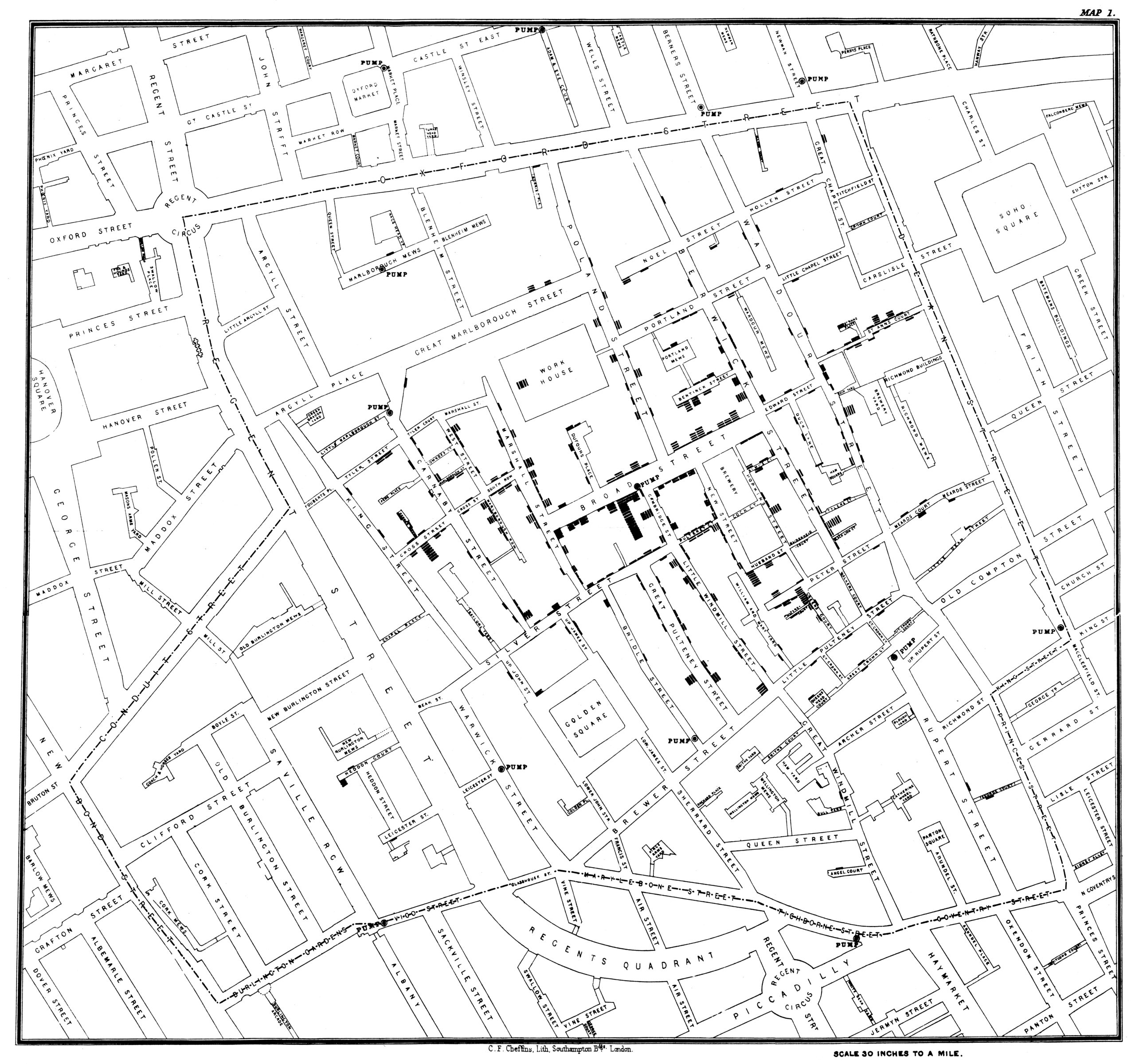
Image description: A black map of streets, including street names, on a white background. Small black blocks on the map indicate the location of cholera cases.
Caption: Map showing the distribution of deaths during the 1854 Broad Street cholera outbreak, drawn and lithographed by Charles Cheffins. Cholera cases are highlighted in black. Public domain/Wikimedia Commons
Russian chemist Mendeleev is credited with formulating a covering law for patterns in the properties of chemical elements, such as their stability, their reactions to other chemicals, and the size and mass of their molecular forms. By grouping these elements according to patterned similarities, he was able to correct some common mischaracterizations of known elements, and also predict the discovery of unknown elements that would fit these patterns. At the time Mendeleev first published his Periodic Law in 1869, there were 56 known elements. Today there are 118, the most recent of which were confirmed in 2016.
Why were they favorites of mine? Something that fascinated me then, nearly 50 years ago—and still does to this day—is how knowledge production is self-correcting. It involves a cycle of prediction, observation, and revision, which can go on indefinitely. And data visualizations play an important role. In the case of both Snow’s Broad Street map and Mendeleev’s periodic table, the visual representation of data led to pattern recognition, which in turn led to revised predictions: What happens to the incidence of new disease cases if we remove the well pump handle? Might there be additional chemical elements that fit in this same pattern?
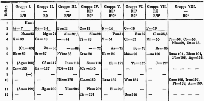
Image description: A table typed by typewriter and showing chemical elements and symbols.
Caption: Dmitry Mendeleev’s periodic table. Public domain/Wikimedia Commons
Fast forward more than a century to the early days of personal computing, when my interest in formal analysis of social network structures was gaining a sharper focus. The first of the compact, sophisticated PC-ready network analysis applications had not yet emerged, but in 1984 I had a chance to meet Australian National University sociologist Alden Klovdahl at the Sunbelt Social Network conference, and was captivated by a paper he presented about visual representations of family social organization. Klovdahl had a strong conviction that visual imagery has proven useful in some of the most important discoveries in the history of science, and he had published a brief note about visualizations in social network analysis. He was working on transforming a computer program that had been developed for representing chemical molecules and compounds into a set of tools for facilitating the analysis of complex relational data, which he hoped would stimulate the development of network theory, and provide new perspectives from which to view previously hidden facets of society.
With Klovdahl’s encouragement, I went on to refine a stochastic sampling process with which he had experimented known as the “random walk” to characterize the structure of a large urban social network. A rigorous sampling technique was needed because it would have been infeasible to do a complete network census. The visualizations were crude, but the analysis helped the Phoenix Indian Center extend its social support services in a metropolitan area where rapid population growth was outpacing the growth in service delivery capacity. Working together with Klovdahl and a multidisciplinary sociomedical team, we subsequently applied this technique to learn about peer influences among adolescents whose behaviors might place them at elevated risk for HIV infection.
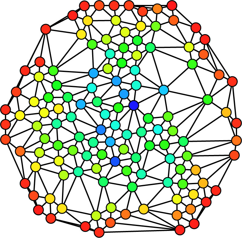
Image description: A spherical graph of circular colored nodes (red, yellow, green, dark blue, light blue, turquoise) with the connections between nodes indicated with black lines.
Caption: A visual representation of social network nodes and links. The color (from red=0 to blue=max) indicates each node’s betweenness centrality. Claudio Rocchini (CC BY 2.5)
Reflecting now on my dorm room artwork, two things stand out. First, visual representations of observational data are terrifically powerful. They serve to crystalize patterns. They can be used as conversation pieces, to elicit reactions, spark debate, and lead to further understanding. And they can capture findings that are legible to wide audiences. The place of “place” in public health interventions has risen substantially in prominence with the growth and increasing sophistication of map displays. The network roles of “bridge” and “influencer” are hammered home by these visualizations as well, and become highly suggestive of points of intervention for systemic change, something very much on our minds these days.
Second, and admittedly not closely related to visual art and artifacts, I am reminded of the irreplaceable value of face-to-face conferences. Even as we launch our amazing fall series, Raising Our Voices, I am really missing them right now. Had it not been for the Sunbelt conference, I probably would not have met Al Klovdahl, discovered our shared interest in data visualizations and social networks, or been propelled in quite the same way to step into the persistent cycle of self-correcting knowledge production. Virtual conferences and events have many virtues and open many opportunities for new kinds of connections and even collaborations, and I look forward to a hybrid future in which we can bring together in-place and virtual gatherings to further advance the methods and materials of our valued field.
Cite as: Liebow, Ed. 2020. “The Art and Science of Data Visualizations.” Anthropology News website, November 20, 2020. DOI: 10.14506/AN.1543